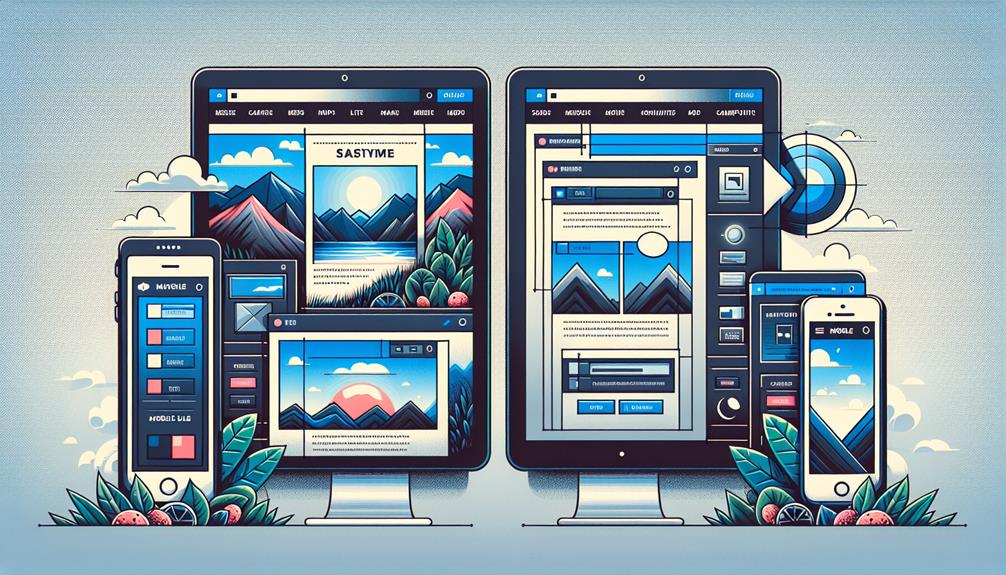
Master responsive web design with advanced techniques like using media queries for targeted styling, leveraging Flexbox for dynamic layouts, and implementing grid systems for complex structures. Enhance customization with CSS variables, adopt mobile-first strategies, optimize images, videos, and add interactivity with JavaScript. These techniques will elevate your design skills and create seamless user experiences. Unlock the full potential of your responsive web designs by incorporating these cutting-edge strategies.
Key Takeaways
- Custom breakpoints for tailored design adaptation.
- Flexbox for dynamic and user-friendly layouts.
- Responsive grid systems for fluid design structures.
- CSS variables for easy and consistent customization.
- Smooth animation effects for enhanced user experience.
Media Queries for Targeted Styling
When targeting specific styles for different screen sizes, utilizing media queries becomes essential in responsive web design. Custom breakpoints allow you to define precisely where your design will adapt to fit various devices. By setting these breakpoints strategically, you can create a seamless user experience across a wide range of screen sizes. Targeted styles enable you to tailor the appearance of your website for specific devices or resolutions. This customization ensures that your content is displayed optimally, enhancing user satisfaction.
With media queries, you have the freedom to craft unique layouts for different devices, maximizing user engagement. By implementing targeted styles, you can emphasize key elements on smaller screens while optimizing space on larger displays. This flexibility empowers you to create a visually appealing website that adapts effortlessly to the user's device. Experiment with custom breakpoints and targeted styles to achieve a responsive design that captivates your audience across all screen sizes.
Flexbox for Dynamic Layouts
Let's explore the fundamentals of Flexbox, which can offer you a powerful tool for creating dynamic layouts. By harnessing Flexbox's capabilities, you can achieve enhanced flexibility in your web design projects.
Additionally, integrating responsive grid systems can further streamline your design process.
Flexbox Basics Explained
Understanding the fundamentals of Flexbox is crucial for creating dynamic layouts in responsive web design. Flexbox alignment allows you to easily position elements horizontally and vertically, giving you the freedom to create visually appealing designs.
When it comes to responsive navigation, Flexbox shines by providing a flexible way to organize navigation menus that adjust seamlessly to different screen sizes. With just a few lines of code, you can ensure that your navigation elements align perfectly regardless of the device being used.
Embrace the power of Flexbox to simplify your layout challenges and achieve a more responsive and user-friendly design. Mastering Flexbox basics will empower you to create versatile and adaptive layouts effortlessly.
Flexibility in Design
To achieve dynamic and flexible layouts in responsive web design, mastering the advanced techniques of Flexbox is essential. Flexbox provides design adaptability and layout flexibility, allowing you to create websites that seamlessly adjust to various screen sizes and devices. With Flexbox, you have the freedom to build complex layouts with ease, align elements precisely, and distribute space efficiently. Below is a table showcasing the power of Flexbox in creating responsive designs:
| Feature | Description | Benefits |
|---|---|---|
| Align Items | Control vertical alignment | Ensures consistent layout |
| Justify Content | Manage horizontal spacing | Creates balanced designs |
| Flex Direction | Define layout direction | Offers versatile arrangements |
| Flex Wrap | Handle overflowing elements | Prevents content overlap |
| Order | Arrange elements sequence | Customizes visual hierarchy |
Responsive Grid Systems
Mastering responsive grid systems with Flexbox for dynamic layouts allows you to effortlessly craft adaptable and visually appealing web designs.
With Flexbox, fluid layouts become intuitive as you can easily create grids that adjust seamlessly to different screen sizes. Adjusting column widths on the fly gives you the freedom to experiment with various design structures without compromising responsiveness.
Flexbox simplifies the process of aligning elements within the grid, offering you more control over the layout's presentation. By utilizing Flexbox for your responsive grid systems, you can achieve a harmonious balance between design and functionality, ensuring your website looks polished and functions seamlessly across devices.
Embrace the flexibility that Flexbox provides in creating dynamic layouts that captivate your audience.
Grid Layouts for Complex Structures
When designing complex structures for responsive web layouts, utilizing grid systems is essential for maintaining organization and consistency across various screen sizes.
Nested grids allow you to create intricate layouts within larger grid systems, providing flexibility and structure simultaneously.
By defining grid breakpoints, you can control how the layout adapts to different screen sizes, ensuring a seamless user experience. This technique empowers you to design websites that look polished and well-structured on any device, from smartphones to large desktop screens.
Grid layouts for complex structures offer a systematic approach to arranging content, making it easier to manage and adjust as needed. Embracing this method gives you the freedom to experiment with various design possibilities while maintaining a coherent structure throughout your website.
CSS Variables for Easy Customization
Utilizing CSS variables in your web design projects offers a convenient way to easily customize styles across your website. By incorporating these variables into your coding, you gain the freedom to quickly adjust elements like color schemes and font styles throughout your site.
Here are four ways CSS variables can enhance your design process:
- Effortless Color Scheme Updates: Easily change the color scheme of your entire website by modifying just a few CSS variables.
- Consistent Font Style Modifications: With CSS variables, updating font styles across your site becomes a breeze, ensuring a cohesive look.
- Streamlined Design Tweaks: Make quick adjustments to various design elements by altering the values of your CSS variables.
- Improved Maintenance and Scalability: CSS variables help maintain consistency in your design and make scaling your project more manageable.
Mobile-First Design Strategies
Incorporate mobile-first design strategies to optimize your website for smaller screens and improve user experience. When focusing on mobile optimization, consider the importance of performance for faster load times. By prioritizing mobile users, you ensure a seamless experience regardless of the device being used. Here is a simple table to highlight key aspects of mobile-first design:
| Mobile-First Design Strategies | Benefits |
|---|---|
| Prioritize Content | Enhances User Experience |
| Optimize Images | Faster Load Times |
| Responsive Layouts | Consistent Look Across Devices |
Responsive Images and Videos
To enhance your website's adaptability on various screen sizes, focus on implementing responsive techniques for images and videos. When it comes to responsive design, optimizing images and videos is crucial for a seamless user experience.
Here are some key techniques to consider:
- Image Optimization: Compress and resize images to ensure faster load times without compromising quality. Use modern image formats like WebP for better compression.
- Video Embedding: Embed videos responsively using HTML5 video players or services like YouTube or Vimeo, ensuring they scale appropriately on different devices.
- Lazy Loading: Implement lazy loading for images and videos to prioritize loading content that's visible to the user, improving page speed and performance.
- Aspect Ratios: Maintain aspect ratios when designing images and videos to prevent distortion when viewed on various screen sizes. This ensures a consistent look across different devices.
JavaScript for Enhanced Interactivity
You can leverage JavaScript to create dynamic content updates and implement smooth animation effects on your website.
By utilizing JavaScript, you can enhance user engagement through interactive elements that respond to user actions in real-time.
These features not only improve user experience but also add a modern and dynamic touch to your web design.
Dynamic Content Updates
Enhance user engagement on your website by utilizing JavaScript for dynamic content updates, fostering a more interactive browsing experience. When implementing dynamic content updates using JavaScript, consider the following key points:
- Real-time Content Refresh: Keep your website content up to date without requiring users to manually refresh the page.
- Interactive Forms: Use JavaScript to dynamically update form fields based on user input, providing instant feedback.
- Live Data Feeds: Integrate dynamic data sources seamlessly into your website for real-time information updates.
- Dynamic Page Elements: Implement animations and transitions to dynamically load content, enhancing user experience and engagement.
Smooth Animation Effects
For a website that captivates users and keeps them engaged, consider integrating smooth animation effects using JavaScript to enhance interactivity. By incorporating techniques like parallax scrolling and transition effects, you can create a visually appealing and dynamic user experience. Parallax scrolling adds depth and movement to your website, giving it a modern and interactive feel. Transition effects, on the other hand, smooth out the user journey by adding elegant animations between different states or pages. These animations not only make your website more engaging but also help in guiding users through the content seamlessly. Experiment with these animation effects to add a touch of creativity and interactivity to your website.
| Animation Technique | Description | Benefits |
|---|---|---|
| Parallax Scrolling | Adds depth and movement | Modern and interactive feel |
| Transition Effects | Smooth transitions between states/pages | Enhanced user experience |
Frequently Asked Questions
How Can Animations Be Incorporated Into Responsive Web Design?
To incorporate animations into responsive web design, you can use scroll effects like parallax scrolling for depth. Loading animations and hover effects add interactivity and engagement. These techniques enhance user experience and make your site dynamic.
Are There Any Tools to Test the Performance of Responsive Designs?
To test the performance of your responsive designs, try tools like Google PageSpeed Insights and GTmetrix. They can help you check browser compatibility and optimize your responsive layouts for better user experience.
What Are the Best Practices for Handling Touch Events on Mobile Devices?
When handling touch events on mobile devices, focus on gesture recognition and touch gestures. Implement swipe navigation for fluid movement and tap interactions for intuitive controls. Keep interactions simple and responsive to create a seamless user experience.
How Can Accessibility Be Prioritized in Responsive Web Design?
Ensure accessibility in responsive web design by prioritizing color contrast for readability, implementing keyboard navigation for seamless interaction, ensuring screen reader compatibility, and including alt text for images. These steps empower users with diverse needs.
What Are the Considerations for Integrating Voice Search in Responsive Websites?
When integrating voice search into your responsive website, prioritize user experience. Optimize for natural language processing and SEO. Enhance accessibility and engagement through voice search optimization, ensuring a seamless and efficient browsing experience for all users.
Conclusion
In conclusion, mastering advanced techniques like media queries, flexbox, grid layouts, CSS variables, mobile-first design, responsive images, and JavaScript will take your responsive web design skills to the next level.
By incorporating these techniques into your projects, you can create dynamic and visually appealing websites that adapt seamlessly to different screen sizes and devices.
Keep practicing and experimenting with these tools to stay ahead in the ever-evolving world of web design. Happy coding!
Pro Website Design San Jose brings over a decade of expertise in web development and SEO to Silicon Valley. Known for creating user-friendly, tailored websites, the Pro Website Design San Jose excels in meeting client-specific needs with innovative solutions, establishing itself as a trusted leader in the tech industry.