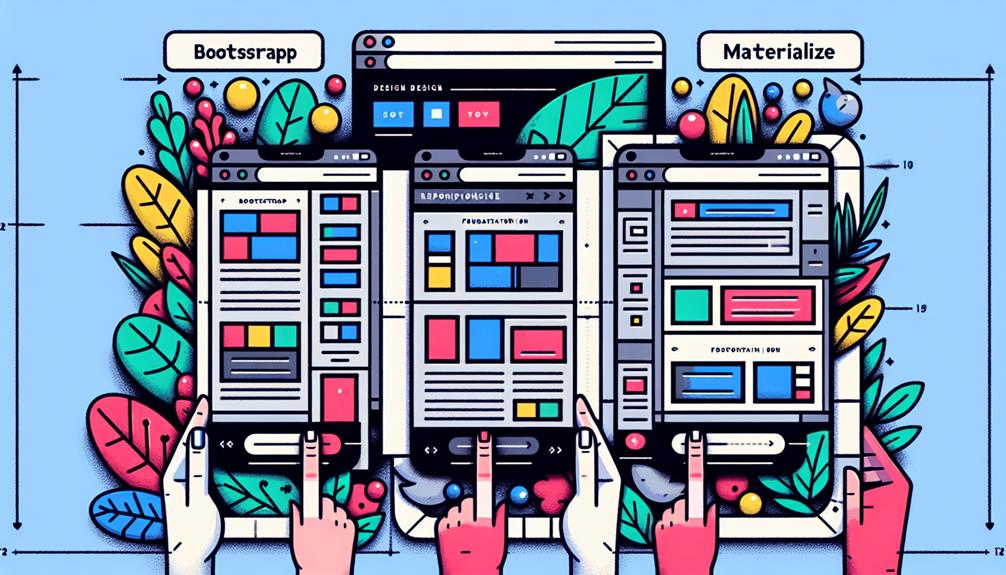
When you're ready to excel in responsive design, consider top front-end frameworks like Bootstrap, Foundation, Materialize, Bulma, and Semantic UI. These tools offer a range of features such as flexible grid systems, customizable components, and mobile optimization. Dive into these frameworks to enhance your web development skills and create stunning websites that adapt seamlessly to various devices. With these powerful options at your disposal, you can take your projects to the next level and elevate your design capabilities to new heights. So, why not discover more about these frameworks to boost your responsive design expertise?
Key Takeaways
- Bootstrap: Offers responsive tools and customization for unique designs with a flexible grid system.
- Foundation: Mobile-first approach, robust grid system, and optimal user experience across devices.
- Materialize: Focuses on mobile optimization, aesthetic design, and exceptional user experience on smartphones.
- Bulma: Modern components, customization options, and seamless integration with JavaScript libraries.
- Semantic UI: Theming customization, pre-built elements, and visually appealing, user-friendly interfaces.
Bootstrap Framework
Bootstrap Framework empowers developers with a robust set of tools for building responsive websites efficiently. Its key features and customization options give you the freedom to create unique designs while ensuring responsiveness across various devices.
The Bootstrap grid system is especially handy, providing a flexible way to arrange content and design layouts without hassle. With pre-built components and JavaScript plugins, you can enhance the functionality of your site without starting from scratch.
Customization in Bootstrap allows you to tailor the framework to suit your project's specific needs, saving you time and effort in the development process. The grid system seamlessly adapts to different screen sizes, making your website look polished on desktops, tablets, and mobile devices.
Foundation Framework
When delving into front-end frameworks for responsive design, the Foundation Framework emerges as a versatile tool for creating dynamic and adaptive websites efficiently. The Foundation framework is known for its mobile-first approach and robust grid system, making it ideal for developers who prioritize responsiveness and flexibility in their designs. With Foundation, you have the freedom to craft websites that seamlessly adjust to various screen sizes, ensuring an optimal user experience across devices.
To showcase the key features of the Foundation Framework, let's explore the following table:
| Feature | Description |
|---|---|
| Responsive Design | Built-in responsiveness for seamless adaptation |
| Grid System | Powerful grid system for creating flexible layouts |
| Mobile First Approach | Prioritizes mobile design for enhanced usability |
Materialize Framework
For a modern approach to responsive design, exploring the Materialize Framework offers a comprehensive solution with its intuitive components and sleek design elements. Materialize provides a wide range of custom components that allow you the freedom to create unique and engaging user interfaces. Whether you're looking to build a visually appealing website or a user-friendly web application, Materialize's custom components make it easy to tailor your design to suit your specific needs.
In addition to its custom components, Materialize excels in mobile optimization. With a focus on ensuring your site looks and functions seamlessly across various devices, this framework empowers you to deliver an exceptional user experience on smartphones and tablets. The mobile optimization features of Materialize enable you to design responsive layouts that adapt fluidly to different screen sizes, making your content easily accessible on the go.
When you choose Materialize for your responsive design projects, you're opting for a framework that prioritizes both aesthetics and functionality, giving you the tools you need to create stunning and user-friendly websites.
Bulma Framework
Consider using the Bulma Framework for a fresh approach to creating responsive designs with its versatile and modern components. Bulma offers a flexible and lightweight option for building websites that prioritize customization and ease of use.
Here are three reasons why you might find Bulma appealing:
- Customization options: With Bulma, you have the freedom to tailor your design to suit your specific needs. The framework provides a wide range of customization options, allowing you to create unique and personalized layouts effortlessly.
- Integration with JavaScript libraries: Bulma seamlessly integrates with popular JavaScript libraries, enhancing the functionality of your website. Whether you want to incorporate interactive elements or dynamic content, Bulma's compatibility with JavaScript makes it easy to implement these features.
- Modern and responsive components: Bulma comes equipped with a variety of modern and responsive components that make designing for different screen sizes a breeze. From grids to navigation bars, Bulma provides everything you need to ensure your website looks great on any device.
Semantic UI Framework
Explore the versatile Semantic UI Framework for creating modern and responsive designs with ease. With Semantic UI, theming customization becomes a breeze, allowing you to tailor the design to suit your project's unique style effortlessly. Whether you prefer a sleek and minimalistic look or a vibrant and colorful interface, Semantic UI's theming capabilities empower you to bring your creative vision to life.
When it comes to component integration, Semantic UI offers a wide range of pre-built elements that can be seamlessly incorporated into your design. From buttons and forms to modals and menus, you can quickly add these components to your project and customize them to match your branding and design requirements. This streamlined approach to component integration simplifies the development process and enables you to focus on creating a visually appealing and user-friendly interface.
Frequently Asked Questions
Are There Any Licensing Restrictions for Using These Frameworks?
When choosing a front-end framework, always check licensing considerations for commercial use. Some frameworks have restrictions, but many are open source, giving you the freedom to use them in various projects without limitations.
Can These Frameworks Be Integrated With a CMS Like WordPress?
Yes, you can integrate these frameworks with a CMS like WordPress for theme customization and plugin compatibility. Ensure performance optimization and implement necessary security measures to maintain flexibility and control over your website.
Do These Frameworks Offer Support for Right-To-Left Languages?
Yes, these frameworks provide excellent support for right-to-left languages. They ensure your responsive design works seamlessly in RTL layouts. Enjoy the ease of cross-browser compatibility and the flexibility to cater to diverse language needs.
Are There Any Specific Browser Compatibility Issues to Be Aware Of?
When focusing on browser compatibility for responsive design, be sure to conduct thorough cross-browser testing. Pay close attention to how media queries and flexbox properties are rendered in various browsers to ensure a seamless experience.
How Frequently Are These Frameworks Updated With New Features?
Frameworks often update with cool new features. They listen to feedback from the community. Stability varies, but updates keep things fresh. You'll find regular improvements. Stay connected for the latest upgrades and enhancements.
Conclusion
So there you have it, the top front-end frameworks for responsive design tutorial. Whether you choose Bootstrap, Foundation, Materialize, Bulma, or Semantic UI, each framework offers unique features and benefits to help you create stunning and mobile-friendly websites.
With these frameworks at your disposal, you can easily build responsive designs that look great on any device.
So pick a framework, dive in, and start creating amazing websites today!
Pro Website Design San Jose brings over a decade of expertise in web development and SEO to Silicon Valley. Known for creating user-friendly, tailored websites, the Pro Website Design San Jose excels in meeting client-specific needs with innovative solutions, establishing itself as a trusted leader in the tech industry.